
Color psychology in interior design influences us more deeply than we often realize. Our bodies respond to colors even without conscious awareness. Scientific studies have shown that our pulse quickens in the presence of red and slows down when exposed to blue or green, even when participants are blindfolded.
The human eye can distinguish over ten million different shades, yet architectural color choices remain surprisingly narrow. In Norway, for example, 85 percent of building facades are painted in black, white, or gray.
Architects and designers must recognize that colors act as stimuli, triggering complex psychological and physiological responses. These reactions, both conscious and subconscious, shape how we experience and connect with spaces.
This piece explores the powerful role color plays in interior design. It dives into the science of how we perceive color and shows how this understanding can be applied to create more engaging, responsive environments.
The science behind color perception
Our understanding of color begins with how we physically perceive it. This process is deeply rooted in biology and shaped through interaction with our environment. Vision is not just about what we see, but how our brain interprets light and form into meaningful color experiences.
How the eye processes color
Our eyes work just like a camera. They use a complex system where light passes through the cornea and pupil to focus on the retina at the back. Millions of photoreceptor cells called rods and cones line the retina. Black and white vision in dim light comes from rods that work mostly in our peripheral vision. The real champions of color vision are cones that work best in bright light.
Human eyes typically have three types of cones that react to different light wavelengths:
- Short (S) wavelength cones – most sensitive to blue
- Medium (M) wavelength cones – most sensitive to green
- Long (L) wavelength cones – most sensitive to red
This trichromatic system lets us see about a million different colors. Our eyes can spot more variations in warm colors because almost two-thirds of our cones respond to longer wavelengths like reds, oranges, and yellows.
The role of light and wavelength
Light’s wavelengths create color. Human eyes can detect wavelengths between 380 and 700 nanometers, known as the visible spectrum. Violet waves measure around 380nm while red waves stretch to about 700nm. Objects absorb some wavelengths and reflect others back to our eyes. This reflection creates what we see as color.
Newton named the ‘Visible 7’: red, orange, yellow, green, blue, indigo, and violet (ROYGBIV). Our brains process color incredibly fast—in just 13 milliseconds, which is 16 times faster than a blink.
Color as energy: physiological responses
Colors do more than meet the eye—they trigger real biological responses. Studies show they can change heart rate variability, breathing, and skin conductance. Different colors in buildings can spark distinct emotional reactions.
Scientists track these effects with advanced tools like electroencephalography (EEG). Their measurements show that colors can grab attention and change emotional states by altering brain activity patterns. Architects need to understand these biological effects when they design spaces for specific uses.
Scientists keep learning more about this complex subject, which helps architects create designs that look good and make biological sense.
Emotional and psychological effects of color
Color influences how we feel, think, and interact. It shapes atmosphere, affects our mood, and even alters physical responses. The emotional weight that different hues carry plays a powerful role in shaping experiences across all kinds of spaces. Understanding these effects helps designers make thoughtful choices that align with human needs, both mentally and physically.
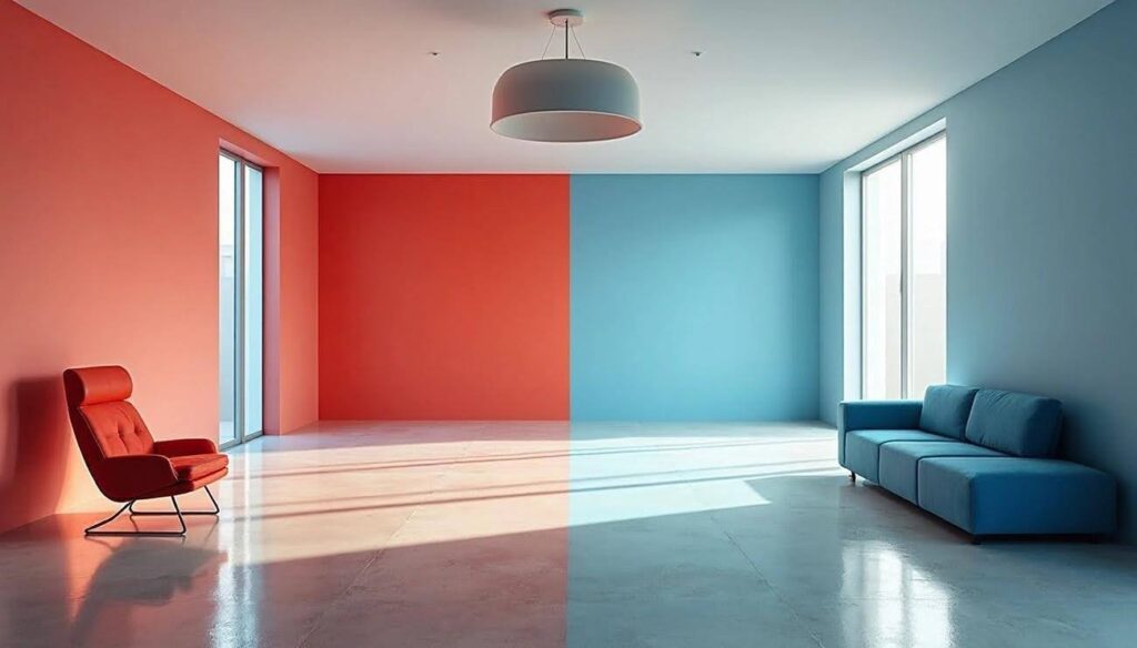
Warm vs. cool colors and their effect
Warm colors (red, orange, yellow) act as stimulants. They create exciting and cheerful environments. Red makes your heart rate, blood pressure, and muscle tension go up. This makes it perfect for spaces that need energy and social interaction. Orange sparks creativity and feels welcoming. Yellow makes things more visible and brings optimism.
Cool colors (blue, green, purple) do the opposite. They create calm and relaxing atmospheres. Blue helps reduce stress and helps you focus better. It acts almost like a natural painkiller. Green brings balance and new energy. Purple creates quiet, thoughtful spaces. Many healthcare facilities use light blues and greens to help patients feel less anxious.
Color associations and mood
Every color brings specific psychological connections:
- Red: passion, determination, intensity, sometimes aggression
- Yellow: optimism, joy, intellect, occasionally jealousy
- Green: nature, tranquility, balance, growth
- Blue: serenity, wisdom, security, occasionally melancholy
- Black: power, elegance, sometimes sadness
- White: purity, peace, occasionally sterility
These connections aren’t just personal opinions—they create measurable hormonal responses that change our wellbeing and behavior.
Color and behavior in public spaces
Colors shape our experiences in public spaces by a lot. Colin Ellard’s research showed that people’s physiological arousal and mood dropped when they walked past plain, fogged-glass façades. Their engagement levels jumped up when they came across vibrant, colorful areas.
Smart use of architectural color encourages social connections. These connections protect us against cardiovascular, endocrine, and immune illnesses. Designers now focus on quality through color to boost social interaction rather than just space quantity. This becomes more important as cities grow—by 2050, living in cities instead of rural areas will become normal worldwide.
Architects and designers who understand these psychological aspects can create spaces that truly support human wellbeing. Color does much more than just decorate.
Designing with color in mind
Thoughtful color use can elevate both the function and atmosphere of a space. It serves as more than just decoration—it helps organize, highlight, and emotionally charge our surroundings. In design, every choice carries weight, and color is one of the most influential tools for shaping experience.
Choosing colors for function and feeling
My color selection process weighs both practical functions and emotional responses. Colors placed strategically guide behavior and draw attention throughout spaces. To cite an instance:
- Entrance highlighting: A contrasting color on an entrance door draws visitors’ attention and welcomes exploration
- Focal point creation: Vibrant, distinctive colors highlight unique architectural features that create immediate attraction and memorability
- Flow management: Colors guide people through spaces and show entrances, exits, and important features
As Michael Wilford notes, “The reason for introducing color is actually to bring another dimension. To bring joy, delight, pleasure and to celebrate the fact that there are certain materials that can be colored as distinct from the use of more natural materials.”
Architectural color and material interaction
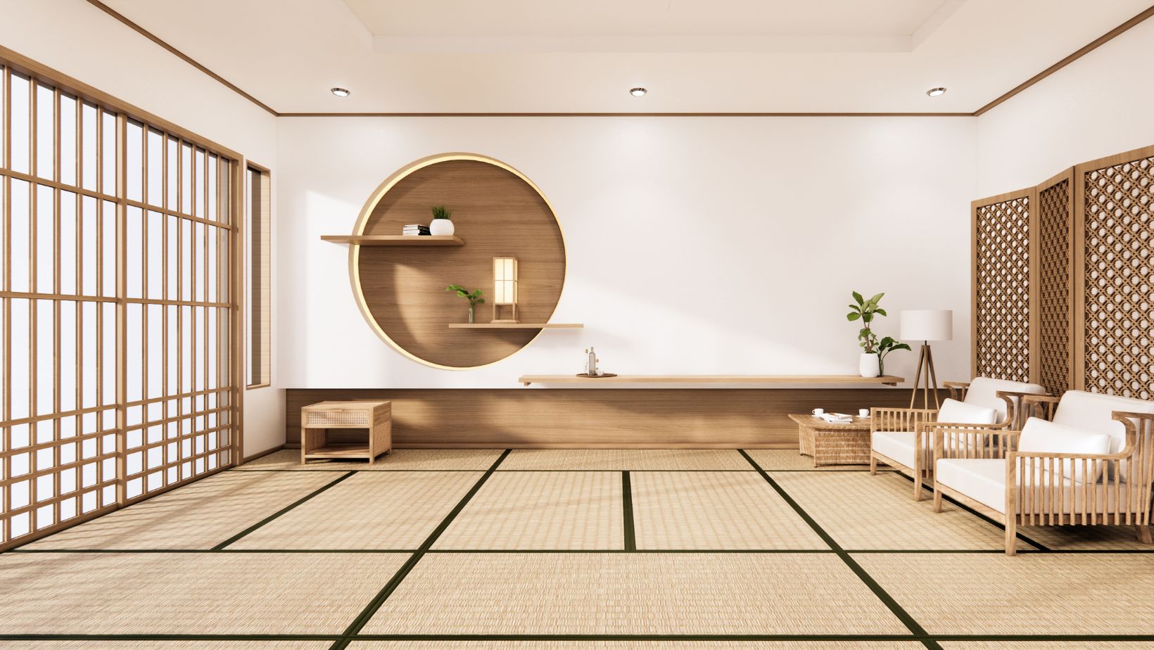
Building materials have their own distinct color properties. Concrete shows a natural grayish hue but takes pigmentation well. Brick colors range from light to dark reddish-brown based on clay type and firing time.
Material and color choices work together inseparably. Bold primary colors might not work with materials like bricks, raw concrete, or natural stone due to their inherent qualities. A material’s texture changes how we notice its color. Gray concrete makes spaces feel heavy and dull, while painted white concrete blocks create positive, peaceful atmospheres.
Lighting’s role in color perception
Light changes how we see colors completely. The Color Rendering Index (CRI) measures light’s effect on color appearance compared to daylight or incandescent sources. High CRI values (90s) show colors accurately, while lower values (below 80) give poor results.
Light color temperature shapes spatial experience. Warm lighting (2200K-2700K) makes cozy atmospheres perfect for restaurants and homes. Cooler temperatures (4100K-5000K) help people work with more precision.
Using natural artwork to improve design
Nature gives us the most harmonious color inspiration. Wright’s organic architecture used natural elements like light, plants, and water with environmental colors such as yellows, oranges, and browns with red accents.
This approach creates spaces that blend naturally with their surroundings and establish visual harmony with the landscape. One simple way to echo this connection indoors is through nature-inspired canvas scenes, such as those offered by Art by Maudsch, which bring soothing, earthy tones and a sense of balance into modern interiors.
How color shapes spatial experience
Color plays a crucial role in how we experience physical space. It guides the way we interpret scale, proportion, and distance without us even realizing it. Through careful use, designers can influence how open or confined a room feels, shift visual focus, and create more balanced environments.
Perceived size and depth of rooms
Light colors bounce more natural light back, making surfaces look bigger and rooms feel more open. Strong colors absorb light and create intimate, enclosed spaces that work well for specific purposes. These effects vary depending on the colored surface:
Lighter wall shades make rooms feel spacious and open, while darker tones create intimacy and coziness. Dark ceiling colors lower the perceived height and create welcoming spaces. White ceilings paired with darker walls give the illusion of height, which helps reduce claustrophobia in apartments with low ceilings.
Color illusions in architecture
Colors create movement that affects visual distances. Black or red surfaces seem to move toward viewers, while white or blue spaces appear farther away. Two objects with the same volume, weight, and shape look different when painted in different colors.
Our eyes can play tricks on us during design. The “café wall illusion” shows how staggered alternating tiles make straight horizontal lines appear angled. Shadows and background colors also affect how we notice correct shades.
Examples of spatial manipulation using color
Architects use several methods to reshape room proportions:
- Paint the back wall and ceiling with matching darker colors while keeping side walls lighter to create wider spaces—this works well in corridors
- Use dark paint on opposing side walls with light backgrounds and ceilings to make rooms look narrower
- Add dark tones to the back wall against lighter colors elsewhere to create intimate large spaces
- Keep architectural features lighter than surrounding areas to make them stand out
These principles make architectural color more than decorative—it becomes a vital tool that changes visual spaces.
Conclusion
Color is one of the most powerful tools in architectural design, capable of shaping both the emotional and physical dimensions of space. Far beyond aesthetics, it engages the senses, alters perception, and influences behavior in subtle yet measurable ways. Through thoughtful use of hue, saturation, and contrast, designers can craft environments that not only look visually compelling but also support human health, comfort, and connection.
As our understanding of color deepens through science and observation, its role in architecture becomes more purposeful. Every shade has the potential to communicate, to soothe, to energize, or to guide. In the hands of a mindful designer, color becomes more than a finishing touch—it becomes an essential element in creating spaces that feel alive, intuitive, and deeply human.
More Stories
How to Read a Cabinet Spec Sheet: A Term-by-Term Translation
Why Compact Homes Are Growing in Popularity
How to Compare Available Apartments Before Making a Decision