
The first time I walked through a home where the color palette flowed naturally from the entryway to the primary bedroom, I understood immediately why some houses simply feel more comfortable to live in.
Nothing about the design was dramatic. There were no bold accent walls or trendy statement colors competing for attention. Instead, the home felt calm, layered, and intentional because every room connected visually without looking identical.
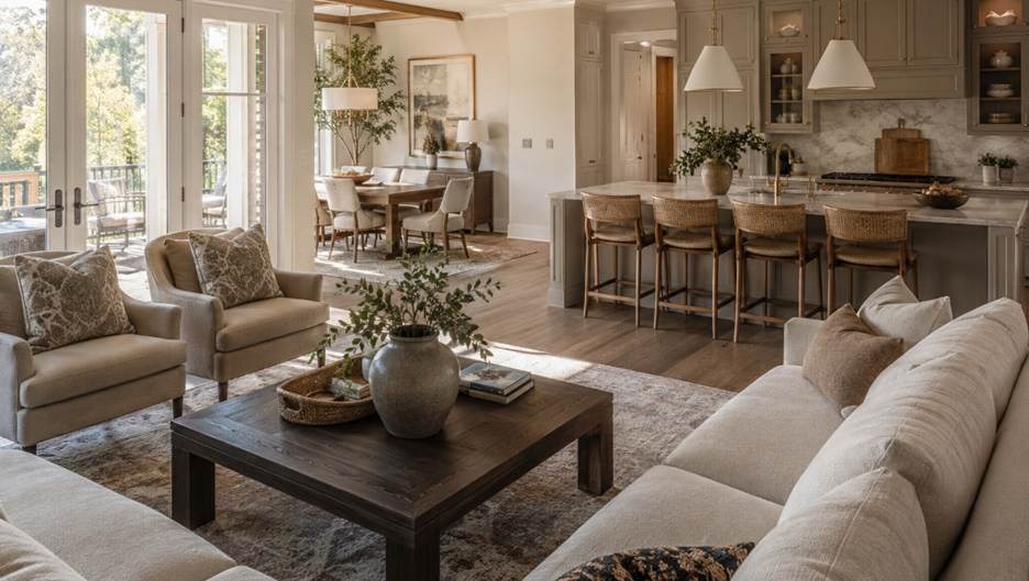
That kind of continuity matters even more in Alpharetta homes today. Open-concept layouts, tall ceilings, oversized windows, and connected living spaces make color transitions highly visible. When one room feels disconnected from the next, the entire house can start to feel visually fragmented, even when each space looks beautiful on its own.
I recently visited a Milton home where the owners had chosen paint colors separately over several years. The kitchen leaned warm cream, the dining room had a cool gray undertone, and the nearby living room carried a subtle blue cast that became obvious in the afternoon light. Individually, none of the colors was bad. Together, though, the house felt slightly unsettled. Once the palette was adjusted around a warmer shared undertone, the entire home immediately felt more cohesive.
That is usually the difference between a house that feels professionally designed and one that feels pieced together over time.
This guide walks through the approach I have consistently seen work best across homes in Alpharetta, Milton, and the greater North Atlanta area.
Key Takeaways
- Cohesive color palettes start with consistent undertones
- Natural light dramatically changes how paint colors appear
- Visual flow comes from balance and repetition, not exact matching
- Transitional spaces often determine whether a home feels connected
- Flooring, furniture, and finishes affect color harmony as much as paint
- Softer, more muted colors usually age better over time
Why Whole-Home Color Coordination Is Harder Than It Looks
Many homeowners select paint colors one room at a time.
A dusty blue may feel perfect for the bedroom. A warm greige works beautifully in the living room. A muted sage feels right for the kitchen.
Individually, those colors may look excellent.
The problem usually appears once all three spaces become visible from the same hallway or open-concept area. Suddenly, the house feels visually disconnected, even though every individual room works on its own.
In most cases, the issue is not the colors themselves. It is the undertones behind them.
Dusty blue often carries purple undertones. Greige may lean yellow or taupe. Sage can shift from gray-green to green depending on the lighting. Even subtle colors can compete with one another when their undertones are inconsistent.
The most successful whole-home palettes usually share the same tonal foundation from room to room.
Step 1: Start With an Anchor Color
Before selecting multiple paint colors, choose one anchor color that will guide the rest of the home.
This is typically the main living area because it connects visually to most spaces.
Your anchor color establishes the overall temperature of the house.
For example, if the main living area uses a creamy warm white, nearby spaces generally look better if they stay within the same warm family. Introducing a cool blue-based white nearby often creates subtle visual tension, especially in homes with heavy natural light.
One design mistake I see frequently in Alpharetta homes is homeowners choosing bright, crisp whites they found online without considering Georgia’s warm sunlight. In west-facing rooms, those whites can feel harsh or slightly blue by evening.
Softer whites and layered neutrals usually perform much better long term.
Anchor Colors That Work Well in Alpharetta Homes
Warm Whites and Soft Off-Whites
- Sherwin-Williams Alabaster
- Benjamin Moore White Dove
Warm Greiges
- Agreeable Gray
- Accessible Beige
Light Neutrals
- Edgecomb Gray
- Pale Oak
Soft Earthy Tones
- Clare Chill
- Benjamin Moore Pale Straw
These colors tend to respond especially well to the warm natural light common throughout North Georgia homes.
Step 2: Build a Three-Tier Whole-Home Palette
Once the anchor color is established, it becomes much easier to build a palette that feels connected without becoming repetitive.
I usually recommend thinking about the home in three layers.
Tier 1: Dominant Colors (60%)
These are the foundational colors that appear throughout the majority of the home.
They often include:
- Primary wall colors
- Larger furniture pieces
- Cabinetry
- Built-ins
- Main flooring tones
This layer creates visual continuity.
Tier 2: Secondary Colors (30%)
These colors add variation while still supporting the dominant palette.
I commonly use them for:
- Upholstery
- Bedding
- Window treatments
- Smaller rooms
- Accent walls
- Dining rooms
This is where depth and warmth begin to develop.
Tier 3: Accent Colors (10%)
Accent colors introduce personality into the home through:
- Artwork
- Throw pillows
- Decorative accessories
- Ceramics
- Smaller furniture pieces
Because these accents occupy less visual space, they can be slightly bolder without overwhelming the home.
The goal is not to make every room look identical.
The goal is to make the entire house feel visually connected.
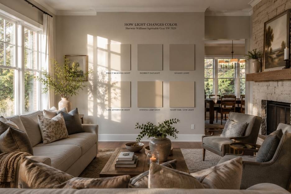
Step 3: Understand How Natural Light Changes Paint Colors
Natural light is one of the most underestimated parts of choosing paint colors.
Homes throughout Alpharetta neighborhoods like Windward, Downtown Alpharetta, and Milton often feature large windows and open floor plans. While that creates beautiful brightness during the day, it also means colors shift constantly depending on the time and direction of the light.
Here is how lighting usually affects paint colors:
- South-facing rooms: Colors appear warmer and more stable throughout the day
- North-facing rooms: Cool tones become sharper while warmer colors may appear muted
- East-facing rooms: Colors feel brighter in the morning and softer later in the day
- West-facing rooms: Rooms can feel flat early on, then dramatically warmer by sunset
One homeowner I spoke with loved a pale gray sample in the store, but once it covered the walls of her west-facing living room, the color looked noticeably lavender every evening.
That happens more often than people expect.
I almost always recommend testing large paint samples directly on the wall and observing them for several days before making a final decision. Small paint chips rarely tell the full story.
A color that feels perfect at noon may look completely different after sunset.
Step 4: Use Transitional Spaces to Create Continuity
Hallways, staircases, and entryways are often overlooked during the design process, but they usually determine whether a whole-home palette feels cohesive.
These areas visually connect multiple rooms at once. If the transitions feel abrupt, the entire house can lose its sense of harmony.
My Preferred Approach for Transitional Areas
- Use the same wall color as the adjacent primary space, or go one shade lighter
- Avoid introducing entirely new color families in connecting spaces
- Keep trim and ceiling colors consistent whenever possible
Consistent trim color is one of the simplest ways to create subconscious visual continuity throughout a home.
Even when individual rooms vary slightly, unified trim helps everything feel intentional.
Step 5: Let Accent Rooms Have Personality
Not every room needs to stay within the exact same neutral range.
Powder rooms, dining rooms, libraries, and home offices are excellent places to introduce deeper or moodier colors because they are visually contained from the rest of the home.
The important part is maintaining tonal consistency.
For example:
- A warm navy often works beautifully beside warm greige walls
- A cool blue-green next to creamy neutrals may feel disconnected
I usually think of accent rooms this way: they should feel like a variation of the same story, not a completely different design language.
How Furniture, Wood Tones, and Finishes Affect Color Flow
Paint alone cannot create a cohesive home if the surrounding materials compete visually. In many Alpharetta homes, homeowners update wall colors while overlooking older kitchen appliances or mismatched finishes, which can disrupt the overall aesthetic. Coordinating cabinetry, hardware, and even scheduling reliable Alpharetta appliance repair services before a redesign can help the entire space feel more intentional.
Once wall colors are selected, the next layer of continuity comes from flooring, cabinetry, textiles, and finishes.
Wood Tones
Warm woods like walnut, honey oak, and natural maple generally support warmer palettes more naturally.
Cool-toned woods, including gray-stained finishes and heavily whitewashed flooring, usually pair better with cooler palettes.
One of the most common mistakes I see is mixing warm and cool wood tones without a clear strategy. The result often feels unintentionally mismatched rather than layered.
Metal Finishes
- Brass and gold read warm
- Chrome and polished nickel read cool
- Matte black often bridges both effectively
I usually recommend limiting a home to one or two dominant metal finishes for a cleaner overall look.
Textiles and Upholstery
Rugs, curtains, sofas, and upholstery all carry undertones that influence the palette.
For example, a cream rug with pink undertones can clash surprisingly quickly with a yellow-based greige sofa, even when both appear neutral on their own.
Whenever possible, review materials together in natural daylight before purchasing.
Local Color Trends I’m Seeing in Alpharetta Homes
Interior color trends across Alpharetta have shifted noticeably in recent years.
The stark white interiors that dominated the early 2020s are slowly giving way to warmer and more layered spaces that feel softer and more lived-in.
The trends I see most often now include:
- Warm whites replacing cooler bright whites
- Earthy tones like muted olive, clay, and terracotta
- Two-tone walls with paneling or wainscoting
- Nature-inspired neutrals pulled from Georgia landscapes
- Softer contrast instead of sharp black-and-white palettes
This shift reflects a broader preference for homes that feel welcoming and personal rather than overly staged.
Design Lessons That Consistently Hold Up
After seeing countless whole-home palette projects come together, a few patterns consistently stand out.
Paint Chips Rarely Tell the Full Story
Paint colors almost always appear stronger and more saturated once they cover an entire wall.
Large test swatches provide a much more accurate picture than small samples.
Most Homeowners Initially Choose Colors That Are Too Strong
When people hesitate between two shades, the softer option is often the better long-term choice.
Subtle colors generally age more gracefully and adapt better to changing decor over time.
Undertone Mistakes Become Expensive Quickly
Incorrect undertones often lead to full repaints rather than simple adjustments.
That is one reason professional color consultations can save homeowners significant time and frustration on larger projects.
The Palette Should Work Before Styling
A room should already feel balanced before artwork and decorative accessories are added.
If a space only comes together after heavy styling, the foundational palette probably needs refinement.
Frequently Asked Questions
How many colors should a whole-home palette include?
Most cohesive homes use four to six core colors. That usually includes one dominant neutral, several supporting tones, and one or two accent colors.
Should ceilings stay the same color throughout the house?
In most cases, yes. Consistent ceiling colors create a unified visual plane that helps spaces flow naturally into one another.
Is it okay to mix paint brands?
Yes, but undertones should always be compared carefully. Similar color names across different brands can look dramatically different once applied.
How do I create flow in an open-concept home?
Treat connected living spaces as one visual environment. Use consistent wall colors and create separation through furniture placement, rugs, and lighting rather than abrupt paint changes.
When is a professional color consultation worth it?
If you feel overwhelmed coordinating colors across multiple rooms or have already repainted several times, professional guidance can simplify the process and help prevent costly mistakes.
The Difference a Unified Palette Makes
A cohesive whole-home color palette is not about making every room look exactly the same.
It is about creating visual continuity that makes the entire house feel intentional, calm, and comfortable to live in.
The most successful Alpharetta homes I have seen follow a consistent system. The undertones align, the transitions feel natural, and the palette responds thoughtfully to the home’s lighting conditions throughout the day.
That level of planning creates spaces that still feel timeless years later.
Whether you are repainting a single floor or redesigning the entire home, approaching color as a connected system almost always yields a more polished, welcoming result.
More Stories
How Antique Pieces Can Make Your House Look Classic
When to Bring in a Professional Architect for Your Home Project
When Is the Best Time to Install Sod in Nashville, TN?