
Immersive digital environments and carefully constructed visual systems have reshaped how you experience casual casino gaming. What might seem like simple entertainment is actually the result of deliberate artistic and interface design, where every detail works to hold your attention and guide your interaction with the screen.
When you enter an online casino platform, you’re immediately surrounded by bold visuals and structured layouts. Every color, animation and thematic choice is positioned with intent.
These aren’t random design decisions. They’re part of a broader system that blends visual appeal with usability, shaping how you move through the experience and how long you stay engaged.
The Psychology of Spatial and Visual Themes
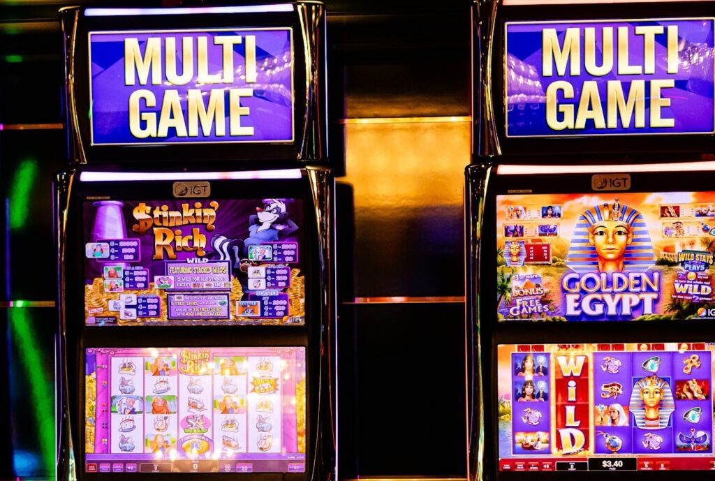
Your first impression of any casino game is almost entirely visual. Before you understand how it works, you react to how it looks. Instead of seeing a set of spinning elements, you’re stepping into a designed environment that aims to trigger a specific response.
Themes play a central role here. A casino game set in ancient ruins leans on warm tones, gold accents and textured surfaces to create a sense of age and prestige. A futuristic setting, by contrast, uses neon colors, sharp contrasts and glowing edges to create energy and movement. These visual cues guide your expectations before you even press a button.
At the same time, good design avoids overwhelming you. The most effective layouts keep everything readable and intuitive. Background elements frame the action rather than compete with it, helping you stay focused on what matters. That balance between visual richness and clarity is what makes the experience feel smooth instead of chaotic.
Architectural Alignment in Premium Digital Hubs
The way these platforms are structured often mirrors real-world design principles. Just like physical spaces are built for ease of movement, online casinos are arranged to help you navigate without friction.
When you move through a large platform like Betway Casino, you notice how different visual styles are grouped and presented without feeling disconnected. A mythology-themed slot can sit alongside a sports-inspired one, yet the transition between them feels natural.
That’s not accidental; it’s the result of consistent navigation systems and layout rules applied across the entire platform.
Menus stay familiar, pathways remain clear and the structure doesn’t change drastically from one section to another. This consistency allows you to explore without having to relearn the interface each time. Even as visual themes shift, the underlying framework remains stable, keeping the experience cohesive.
Dynamic Motion Artistry and Feedback Loops
Movement is what brings these designs to life. Without animation, even the most detailed visuals would feel static. Instead, every interaction you make triggers a response, creating a continuous loop between action and feedback.
You see this in small but noticeable ways. Symbols might expand slightly when selected, glow when aligned or dissolve into particles when they disappear. These micro-animations confirm that the system has registered your input, making the experience feel responsive rather than distant.
Several visual techniques are commonly used to maintain this rhythm:
- Cascading transitions that replace traditional spinning with fluid downward movement
- Typography that shifts in size or color during key moments
- Lighting effects that highlight active lines or outcomes
- Background changes that signal shifts into bonus modes
These elements do more than decorate the screen. They help you follow what’s happening without relying on text or explanation. The pace of these animations also matters. Too slow, and the experience drags. Too fast and it becomes hard to follow. When done well, the timing keeps you engaged without feeling forced.
The Structural Legacy of Physical Mechanics
Even with all this digital advancement, many design choices still reference older mechanical systems. You’ll often notice visual elements that mimic physical levers, metallic finishes or button layouts. These are deliberate nods to earlier machines, providing a sense of familiarity.
This connection to the past helps ground the experience. While the visuals may be modern, the structure often remains recognizable. Three-reel and five-reel formats, for example, continue to appear because they’re easy to understand and widely known.
Platforms like Betway Casino maintain this balance by keeping familiar structures while expanding what those structures can do. You might see traditional layouts combined with larger grids or added layers of interaction. The core idea stays the same, but the presentation evolves.
Graphic Depth and Future Design Directions
As display technology improves, the level of visual detail of online casinos continues to increase. Techniques like parallax scrolling create a sense of depth by moving background and foreground elements at different speeds. This gives the impression of a layered environment rather than a flat screen.
You experience this as a subtle form of immersion. The space feels larger, more dynamic and more responsive to your actions. It’s no longer just about what’s happening on the reels; it’s about the environment surrounding them.
Looking ahead, design is likely to push even further in this direction. More advanced lighting systems, real-time rendering and detailed particle effects will continue to refine how these experiences look and feel. The goal isn’t just realism but coherence, ensuring every visual element works together without disrupting usability.
More Stories
How to Choose the Ideal Neighborhood for Your Luxury Home
Designing for Density: How Architecture Adapts Across Major U.S. Cities
Most Popular Barndominium Floor Plans (and What Each One Costs)